These standards are provided as a guide to designers who plan future buildings and grounds for Kalamazoo College. The historic campus core has a unique, charming character which speaks to the campus spirit. This spirit should be present in any future building effort, and the guidelines proposed herein aim to capture the College’s campus center and define the campus as one complete unit.
The goal of these guidelines is to unify campus, define campus edges, and integrate the scale of new buildings into the historic neighborhoods that surround campus. These guidelines are meant to preserve the historic campus core, yet allow for architectural innovation where appropriate.
Recommendations on building envelope, function, weight, and roofing are illustrated in Chapter 5.
Included in this section are the following:
- Existing Campus Conditions
- Guidelines for New Campus Buildings
- Guidelines for New Site Furnishings and Landscaping
Existing Campus Conditions
The analysis of the existing campus buildings and grounds will be broken down into the following categories: Typology, Massing, Facade Elements, Materials, and Site Furnishings and Landscape.
Typology
Typology is a term used to not only describe the footprint and geometry of a building but also the function of the building and how that function is portrayed by the building’s overall appearance. For example, trying to make a structure filled with faculty offices appear as a church would probably not be the best practice, as the building in question would be confusing to a new visitor expecting to find a worship space. The current K College campus buildings in general display quite well the function that lies within. Take, for instance, Stetson Chapel. Its prominent site location and bell tower belie what is within – a chapel steeped in history at the center of the main campus quad. While not all are so easily recognized, most do not require extensive analysis. Anderson Hall, home to performance courts and recreation spaces, takes on the shape of an athletic/recreation center and is easily recognizable as such.
Massing
The building massing of the existing campus context is varied. Some buildings are one story, while others have five stories of program including their attic levels. The overall footprints of the buildings also take on very different forms, each defined primarily by its programs and typology. Hoben Hall, for example, is long and narrow based on the need for light in each of its dormitory rooms. Further, the facade is broken down so its mass is not so imposing. Arched forms, small punched openings, and the vertical division of the building into base, middle, and top make the overall scale of the building more manageable to the eye and to the pedestrian. Anderson Hall is an example of a campus building whose mass is not broken down so carefully and, therefore, does not relate well to the scale of a pedestrian.
Facade Elements
Using smaller, residential scale facade elements to break down the overall building mass is a typical feature of the K College vernacular. Vertically oriented, double hung windows are fixtures in the historic campus core. Dow Hall (located on the north edge of campus), conversely, uses almost square windows as its punched openings. While this proportion may fit its “campus edge” status, inserting the same windows into the campus historic core would seem out of place.
Materials
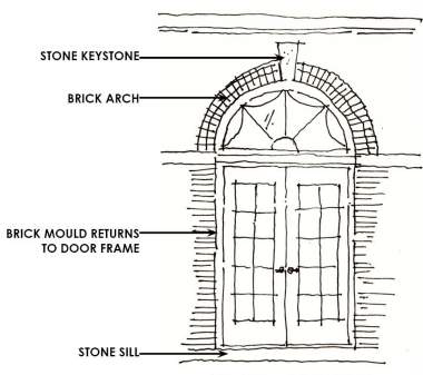
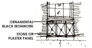
Stone keystones, low brick arches, shutters, shed dormers, brick quoins, and white painted mouldings also make frequent appearances on buildings around campus. These facade elements and their materials make up a smaller “kit of parts” that could be used to unify new campus buildings with their predecessors. Brick and stone are the predominant materials used on campus. Ironwork accents below windows punched at the main floor of a building are also quite common. Bronze signage and building accents, as well as copper flashing details can be found in several locales and should be replicated where appropriate.
Site Furnishings
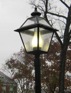
The site furnishings presently existing on campus are greatly varied. Many different benches, trash cans, and retaining wall materials exist. Light poles are traditional in appearance. Unifying the standard fixtures to replace these elements would create a cohesive campus and help to define the edges.
Landscape
One of the best landscape features on K’s campus is the Historic Quad. The four acre site marks the historic beginning of K’s campus. The soil and topography are very much the same as they were when the college was originally established. The tall native trees with their suspended canopy and the uninterrupted lawn laid upon a rolling hillside creates a space that is welcoming and beautiful. Foundation planting is kept to a minimum, allowing the details of the Georgian Architecture to be noticed. Beyond the Historic Quad, a majority of the native plantings and soils have been disturbed by development. The master plan aims to suggest strategies for extending the landscape character of the historic quad to other parts of the campus.
Guidelines for New Campus Buildings
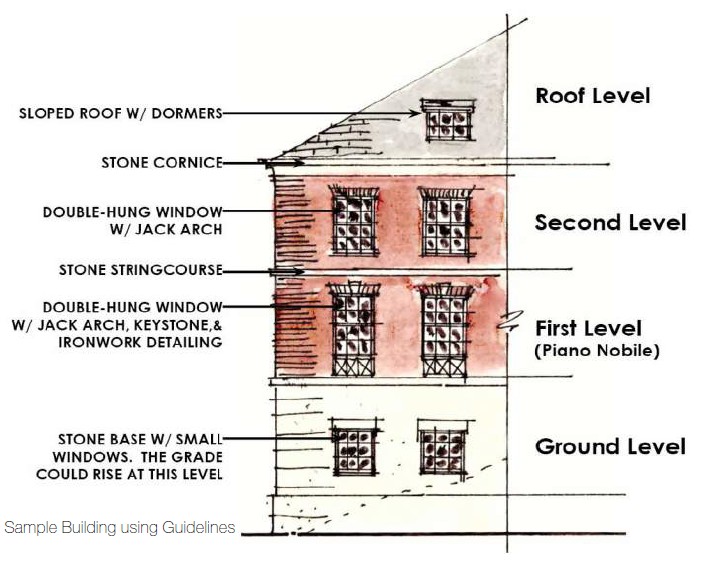
While the architectural style on K’s campus is predominately Georgian, simply inserting a typical Georgian building without taking into account the campus vernacular may be ill-advised. The existing context should be noted and used when making design decisions, particularly in the Historic Core areas. There may be, of course, instances outside of the Historic Core where buildings may deviate from from Georgian style, but principles remain across any style the campus would use, such as entrance and windows/transparency, clearly defined bottom, middle, and top of the facade.
Typology
New buildings should have a recognizable form: a building’s overall shape should represent the function of the structure.
Massing
Large building masses should be broken up into smaller facade elements to reduce large masses to a more human, relatable scale. Individual facade elements and the overall building should be broken into a tripartite scheme: base, middle, and top.
Facade Elements
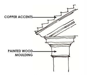
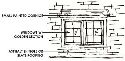
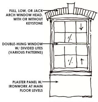
Windows with vertical proportions and divided lites should be used. Various grille patterns exist on campus, so again, the context should be taken into account when choosing the proper pattern. The main floor, or piano nobile, of a building generally incorporates a plaster or stone panel below the window opening with ironwork. Windows should use traditional lintels: jack arches, low arches, keystones, and stone bands above punched openings. No side architraves should be used. Arched forms and shed dormers are common on campus. Painted mouldings similar to the one pictured below are incorporated to frame and emphasize doorways. Using similar elements will help to unify the campus aesthetic.
Materials
Materials must look to the campus vernacular: red brick, limestone, painted mouldings, copper and bronze detailing, and black ironwork accents. Stone accents in keystones, string
Site Furnishings
As with the Design Guidelines for buildings, the Design Guidelines for site furnishings are intended to unify K’s campus.
- All metal finishes should be black, which is a finish used often in the ironwork details that exist on campus today.
- Stone and brick retaining and seat walls should be used wherever possible.
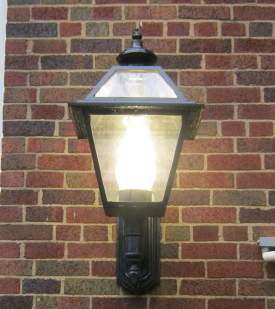
- Light fixtures and poles should replicate the standard existing in the Historic Core.
- Recycling and Waste bins should be Landscape Forms “Poe”.
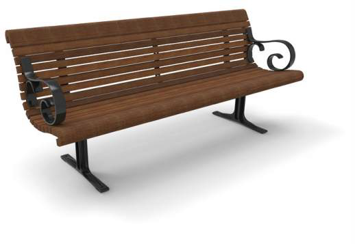
- Benches should be Landscape Forms “Melville”.
- The Belson “Winder” is the current bike rack used across campus. K College could consider a new complementary style of bike rack to better meet the needs of the campus community.

Landscape Forms “Poe”

Landscape Forms “Poe”

Belson “Winder”
Landscape Recommendations
- Develop a 2nd generation of native hardwood trees within the Historic Core to preserve the character of the space.
- Use lawn as an element in the landscape by creating well defined beds that help define the lawn areas.
- The Grove: Remove invasive species and reintroduce native trees and understory plants.
- Use native plants and trees throughout campus.
- Develop bioswales along edges of roadways and campus to help manage storm water runoff and promote infiltration of water into the ground.
- Use seasonal color in large pots for impact and ease of maintenance.
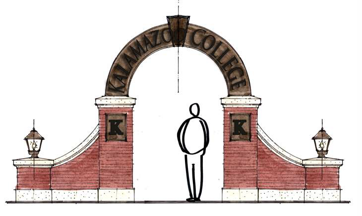
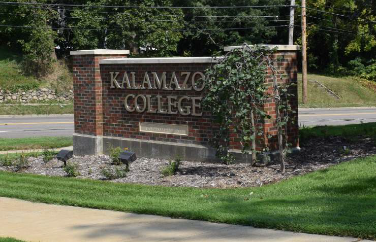
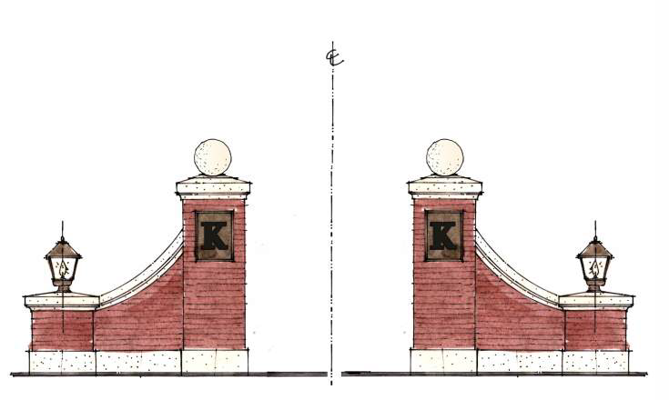
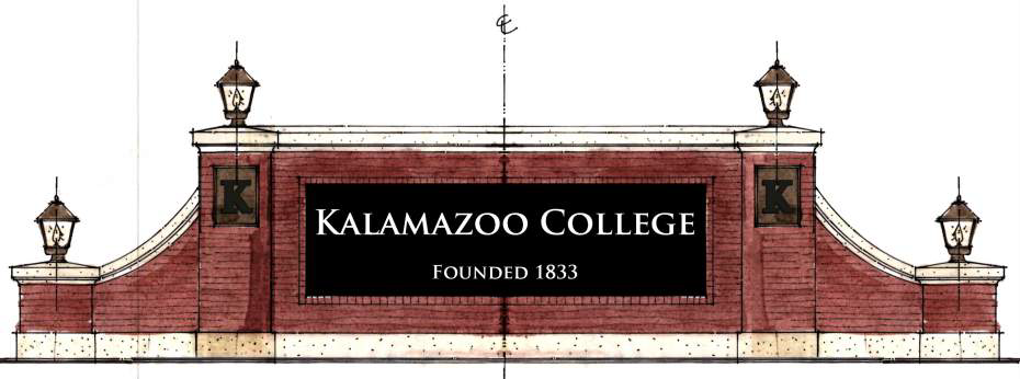
Gateway Signage
The Master Plan recommends that new gateway signs use traditional materials that exist in K’s campus core, and help announce K’s architectural approach at each campus entry.
- Brick, limestone, and bronze accents are incorporated, as well as the use of high-contrast center aluminum panels.
- Use architectural elements with the same materiality to frame Academy Street, creating a new vehicular gateway experience.
- The smaller-scale pedestrian sign incorporates an aluminum arch in a bronze finish to serve as a gateway.
